Rich Text Editor Accessibility Guidelines
Sakai uses a single consistent Rich Text Editor across all areas where text can be added that is more than a few lines. This editor is based on the most recent stable version of the CKEditor.
When creating content using the rich text editor, it is important that the author follow the simple guidelines below to ensure that the content can be read and understood by all. Creating well structured and accessible content is a best practice that ensures content is compatible with assistive devices, robust enough to be copy and pasted to other contexts or presented in unanticipated contexts, and is a legal requirement in some jurisdictions.
The technical measure of the accessibility of the format of a web-based resource is the WCAG 2.0 standard from the W3C. The requirements of the WCAG 2.0 are summarized in the four letter acronym POUR:
- Perceivable - Information must be presentable to users in ways they can perceive.
- Operable - User interface components, navigation and structure must be operable.
- Understandable - Information and the operation of user interface must be understandable, and structure elements are used in a meaningful way.
- Robust - Content must be robust enough so that it can be interpreted reliably by a wide variety of technologies, including assistive technologies.
These relatively simple considerations make a big difference if applied when content is created. The W3C provides more information in their Introduction to Understanding WCAG 2.0.
Images
Users with some disabilities will be unable to see images and/or comprehend what they are meant to convey.
When to Add Alternative Text Descriptions for Images
- Simple image with "simple meaning" - add descriptive alternative text of 10 to 169 character as outlined below. The alternative text should describe the educational/informational purpose of the image
- Complex image with "rich meaning" - add a paragraph above or below it that goes into more detail. Some pointers ("Next image," "Previous image") will help tie them together. If the image is referenced from elsewhere in the document, add a paragraph below it that can serve as a caption, and then refer to it. If the longer alternative text is not feasible, create a link to an external Web page that contains an appropriate description.
- Decorative image - if the image is purely decorative or used for visual formatting, the alternative text description should be left blank to hide it from users of assistive technology
Examples Text Alternatives
- Alt Text: “Scientist in a lab filling a vial with fluid”
- Description in the text before or after the image: “Next/Previous image shows a female forensic scientist is filling a vial containing a small about of blood with fluid to denature the sample as part of the process of the PCR analysis method of DNA profiling. In the background is a centrifuge which will aid in the process of extracting the DNA from the sample of blood.”
- Reference farther away in body
"... Figure 1.3 shows the correlation between the...."
[Image] Figure 1.3
Steps to Add Alternative Text
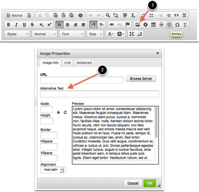
- Activate the “image” button on the toolbar.
- Locate the “Alternative Text” input form control in the dialog that is loaded after you activate the button. Place the appropriate alternative text in the form field provided.
[Figures 1 and 2: CKEditor Menu and CKEditor Image Options Panel. For screen reader users working with the CKEditor see the <link to ckeditor section>Accessibility Documentation </link>]
Document Structure
Assistive technology users rely heavily on headings to navigate complex content. Structuring complex content will help all users parse it as well.
When to Add Structure with Headings
If a document can be outlined or you have an outline in mind when writing it, then adding headings will convey its structure. Some notes:
- Nest headings appropriately:
- Heading 1 > Heading 2
- Heading 2 > Heading 3, Heading 3, Heading 3
- Use short title-like headings that describe content that follows
- If the content you are creating is an HTML Resource start with a Heading 1, in all other cases start with a Heading 4, since the application is already using Heading 1 through Heading 3. Your content in these cases will always be a child of a pre-existing Heading 3.
Examples of Structure
This document is an example.
Steps to add Headings
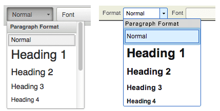
Headings are available from the Format menu. This can look like one of the two examples above.
[Figure 3: CKEditor Format Menu. For screen reader users working with the CKEditor see the <link to ckeditor section>Accessibility Documentation </link>]
Note: the default size of the Headings can always be adjusted with the Size menu. The default size of some of the higher headings (h5 - h6) may need adjustment. Conversely, do not use headings for typographical effects.
Using semantically helpful elements
Assistive technology users benefit when the page elements used have a relationship to the meaning they are trying to convey visually.
Lists
If you think of a vertical series of items as a list, you should include it in your page as a list. Select the lines involved and click on the numbered or bulleted list option.
[Figure 4: CKEditor List Buttons. For screen reader users working with the CKEditor see the <link to ckeditor section>Accessibility Documentation </link>]
Paragraphs
A paragraph (hit Enter or Return) is always more meaningful than a line break (hit Shift + Enter or Return).
Inline styles
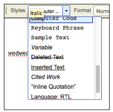
Using the right style to format a bit of text is very helpful as it "codes" it appropriately. These are all available in the "Styles" menu:
- Cited work
- Inline Quotation
- Computer Code
- Sample text
- Inserted and Deleted text
If you are curious to see what these do, add one and switch to "Source View" - this is how a screen reader will "see" it. Inline quotation will use <q>, which will signify the opening of an inline quotation, very helpful. Cited Work will create an element that presents itself as such. Conversely, avoid using these special formats to achieve a typographical effect. Cited Work produces italic text. But it would be confusing to a screen reader if you used it just for that reason.
[Figure 5: CKEditor Styles Menu. For screen reader users working with the CKEditor see the <link to ckeditor section>Accessibility Documentation </link>]
Do Not Use Color or Spatial Position to Convey Information
For Example, "click the green button on the left." Color blind users will not be able to distinguish the button. For screen reader users there is no notion of "left" - the best solution is to quote the target label:
Click on "Start Assignment," or Click "Save" button.
Use Adequate Color Contrast
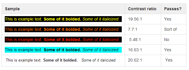
Many users will have visual impediments that will require good contrast in the documents you are producing. The best way to help these users is to make sure that the contrast between background and foreground has a ratio of 4.5:1 or higher. Leaving the defaults of the editor intact is best - as that will likely be black text on white, with a ratio of 21:1.
Examples of Contrast
Steps to Change Foreground and Background Colors
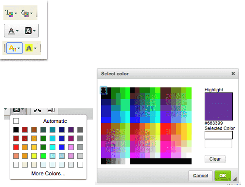
If you need to edit the background color and the text color click on either control shown below (the buttons will look like one the choices below, with foreground color on the left and background color on the right).
In most cases the contrast will be obvious, but if you need to verify, click on the "More Colors" option, record the the hex number for the color you have selected (starting with #) and check the two colors through an online tool such as WebAIM's Color Contrast Checker.
[Figure 6: CKEditor text color and background buttons. For screen reader users working with the CKEditor see the <link to ckeditor section>Accessibility Documentation </link>]
[Figures 7 and 8: CKEditor "More Color" options. For screen reader users working with the CKEditor see the <link to ckeditor section>Accessibility Documentation </link>]
Using Tables
Users of screen readers cannot read tables the same way sighted users do. Sighted users can tell at a glance what column and row a given cell is associated with, a screen reader user needs a properly coded table. To make tables usable we need to put in a little bit of work into them.
Examples of Tables: Simple table
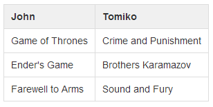
Simple table: books read by 2 people. Only column headers are needed
Examples of Tables: Complex table
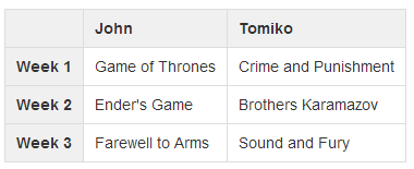
Complex table: books read by 2 people each week. Column and row headers needed.
In the second example a screen reader user will know that The Sound and the Fury was the book read by Tomiko on Week 3.
Steps to Making Accessible Tables
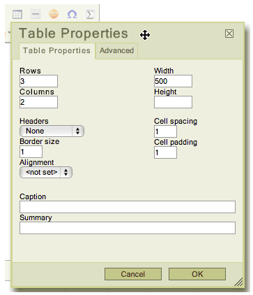
When adding a tables add a row and/or column to be used as a heading for each as appropriate. The table creation menu contains a Headers options that allows for selecting the first row, column or both.
Add a Summary of the table. The table creation menu offers a line to add a summary that will inform readers of the content of the table. Good examples are: "Data from recent study," "Table of inputs and outputs" etc.
Tables should only be used for tabular data, not for layout.
[Figure 9: CKEditor table panel. For screen reader users working with the CKEditor see the <link to ckeditor section>Accessibility Documentation </link>]
Links
Use Unique and Descriptive Link Text
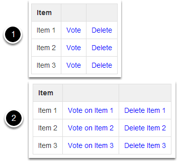
Assistive technology users use link lists to navigate content. This means they cannot rely on context to tell what a link does. This is why each link needs to be uniquely descriptive of what it does. The best place to uniquely identify a link is in the link text. Good examples are: "View Assignment 34," "Visit Entomological Society of America," etc.
- In lists where each item has several links associated with it the temptation would be to do the first example shown above.
- The second example shown above would be better, if a bit verbose.
Add Alternative Text for Image Links
For every HTML web link embedded into the rich text editor that contains only an image and no textual content, concise and descriptive alternative text is mandatory (see above for instructions). The alternative text should describe the purpose of the link (e.g., The "destination" that the user will be taken to upon activation of the link.)
Steps to Add Alternative Text
- Activate the “image” button on the toolbar.
- Locate the “Alternative Text” input form control in the dialog that is loaded after you activate the button.
- Place the appropriate alternative text in the form control following the guidelines in the heuristics section.
Identify File Types in Links to Downloadable Files
Assistive technology users will benefit from knowing what type of file it is they are downloading. When you link to a file in the Editor, include the information in the link text.
Example: essay (MS Word), report (PDF), presentation (MS Powerpoint).
Use Unique and Descriptive Page Titles
Assistive technology users rely on page titles. You will only run across the need to specify this when you are creating an HTML page in the Resources tool. The title of the new document will be the same as the name of the item as it shows on the list.
